So what’s going on with this business of adding 2 spaces after a full stop?
Have you come across this? Or, do you do it yourself when writing letters?
As a graphic designer, type layout and design is an integral part of my job and I have been removing double spacing after the full stop from large bodies of text since the 1990s when I first started in the industry. But even in the last few months, I have been asked by clients to put back the extra space. So, it looks like there is no sign of the controversial double space going away just yet.
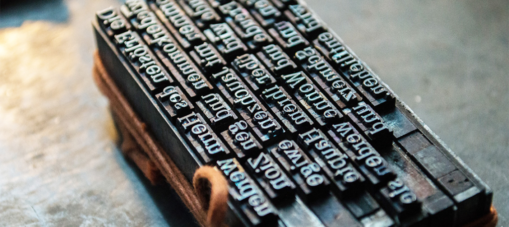
So why did this start happening in the first place? Well, the quick answer is: blame the mechanical typewriter – invented in the late 19th Century.
But to understand more about this phenomena, we need to look further back in time to the history of printed text.
Since the invention of movable type (Moveable type is the system of printing and typography that uses movable components to reproduce the elements of a document) which dates back as far as the 14th Century. Printers and typesetters have been using proportional spacing between the letters within a word.
Proportional spacing uses adjustable spacing between the letters in each word. This helps to create a more unified word within the sentence. If you think about the fact that two OOs next to each other looks very different from the space between two IIs or a P next to a W.
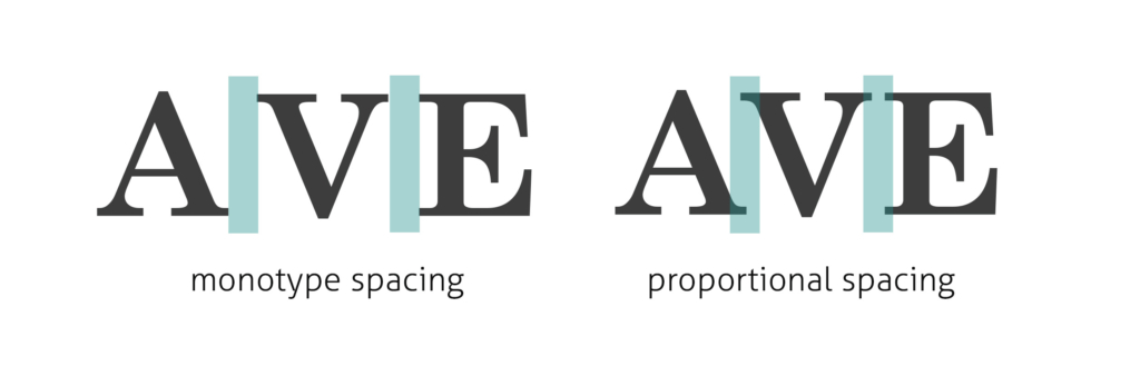
But when the manual typewriter was invented, it was simply not possible to use proportional spacing because the keys are stationary and therefore not movable type. So it used monospacing instead – which is equal spacing between the letters.
If you look at the difference between the words that are proportionally spaced and the same words with monospacing, you can see the difference – and how much gappier the monospaced word really is.
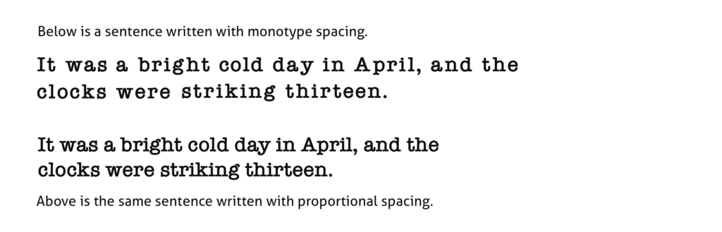
So naturally, because of the wider spacing of the monotype typewriters letters, an additional space was needed at the end of the sentence, to help differentiate and make a clearer gap between each sentence.
This then became the standard format for all secretarial and touch-typing training from this point onwards.

So for many decades (before digital print) the printed word fell into 2 clear categories: typewritten letters and documents produced by secretaries and administrative staff (who used the double space); and typeset printing: books, magazines, newspapers, posters and leaflets produced by typesetters in printing houses (who used proportional spacing and NOT double spacing).
It was not until computers and digital typing began being used in the 1980s that things became more complicated and the lines between the two began to blur. And now that digital printing is used as standard, anyone can provide the wording for a magazine or brochure, whether they are touch-type trained or not.
So should we use double spacing now or not?
Well, we certainly don’t NEED to use double spacing (unless you are blessed with a vintage manual typewriter that actually still works).
And let’s be clear, The Complete Manual on Typography (2003) states that “The typewriter tradition of separating sentences with two-word spaces after a period has no place in typesetting” and the single space is “standard typographic practice”.
But also there are some very good reasons not to use double spacing in the printing industry too:
Firstly space. Can you imagine how many extra pages it would add to a book if there was an extra space after the full stop? Even the wording in a brochure can end up taking too much room if there is double spacing throughout – leaving less space for images and graphics.
Secondly, in columns of text, double spacing can help to create ‘rivers’ – which are the areas of white space that accidentally run through the columns of text. The aim of a good typographer to is to create easy to read wording that flows well, and rivers within text make it more difficult to read and can cause the reader to lose concentration.
And finally, it just doesn’t look very pleasing on the eye – gappy text stops the continuity of reading, but also doesn’t look nice when the neatly lined paragraphs are broken up with gaps.
Having said all this, plenty of people argue that the use of double spacing in legal documents, forms, and formal letters is still going strong – which is fine by me. Anything that was traditionally drafted by a touch-typist secretary in the first place, seems fitting to continue this tradition in my opinion.
Did you enjoy this blog? Why not sign up for our FREE 17 Marketing tips emails delivered straight to your inbox. Simple, easy tips that could help you think differently about your marketing. Just click here to sign up.


Leave A Comment