So, what do you think I am going to say here?
Let me guess… that purple is luxurious? That green is peaceful? And that red will get you more clicks?
Yes, I know there are an endless amount of blogs out there professing they can tell you which colours you should use in your marketing. That the benefit of using red in your marketing is that apparently, it’s exciting, bold and full of danger.
If only it was that simple.
But it isn’t.
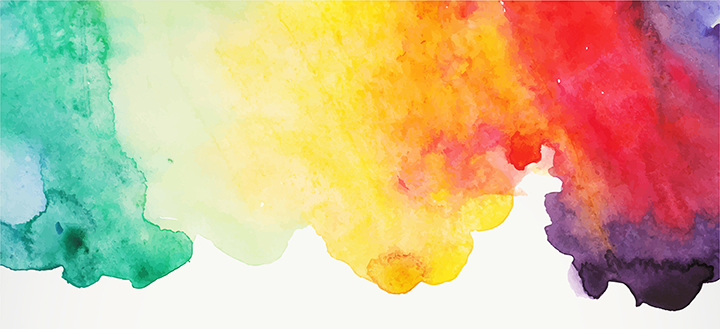
The world of colour within marketing (as well as every other area of life) is, in fact, an extremely complicated and emotive subject.
3 reasons make colour a complicated subject:
1. Colour cannot be separated from the other colours around it that influence its effect.
Paired with at least one other colour, the influence of a colour can change dramatically. For example,
pink & brown have a very different impression on the eye than pink & red.


2. Colour influence is dependent on personal experience.
Research shows that many elements such as personal preference, past experiences, upbringing, cultural differences, context, etc often muddy the effect colours have on us. So the idea that a colour can evoke a universal effect like green being relaxing is very unlikely.
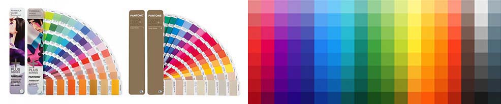
3. Colour effect changes depending on the market sector.
Not all colours have the same impression in every market or industry. For example, orange has a very different status in the telecommunications industry than it does in the fizzy drinks market.
But despite its complicated, contentious nature, colour clearly plays a major part in marketing and brand recognition.
Studies show that:
Color increases brand recognition by up to 80 percent
Source: University of Loyola, Maryland study
Ads in color are read up to 42% more often than the same ads in black and white
Source: White, Jan V., Color for Impact, Strathmoor Press, April, 1997
Tests indicate that a black and white image may sustain interest for less than two-thirds a second, whereas a colored image may hold the attention for two seconds or more.
But what you really want to know is how colour can affect your marketing don’t you?
So here are some real facts about colour in marketing
- Bright colours attract initial attention in advertising, but dark text on light background keeps the attention of the reader for longer with the smaller text
- Red headlines attracts attention – but should never be used for small text
- Using a larger palette of colours than 2 colours makes for more sensitive and inviting marketing
- Blue is the most overall liked colour amongst adults of both gender
- Brown is the most disliked colour amongst adults of both genders
- Red stimulates an appetite because of its effect on metabolism. Which is why it is often used by fast-food companies
- Blue can be a calming colour but used excessively it can be an appetite suppressor
- Use a contrasting/complementary colour from the opposite side of the colour wheel for the ‘buy now’ button or anything you want to stand out as your call to action
Would you like to talk about your visual marketing? Then drop me a line at steph@othencreative.co.uk


