
Have you noticed that there are times when it is just as important to notice what is missing, as what is right in front of you?
This is an important trick often used by designers when creating distinctive and memorable logos.
It is known as the use of negative space. What do I mean by this?
Negative space is the white space that surrounds a logo. It is just as important as the logo itself and defines the boundaries of positive space and balances the logo.
Clever use of negative space is a way of creating unique and memorable logos whilst keeping a simple form.
Here are some of my favourites:
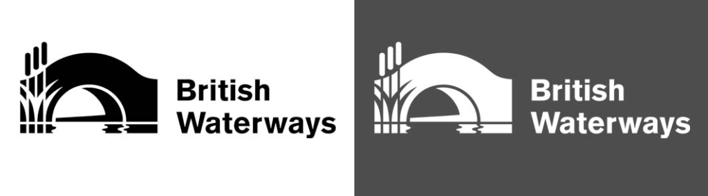
The British Waterways logo was designed by Pentogram over 20 years ago. It cleverly combines a bridge over water, with reeds embedded in the negative space within the bridge.

Similarly, The Waterways Trust logo was also designed by Pentagram beautifully combining a duck carved out of the reeds which are also designed to look like caring hands. Pentagram has a long history of supporting the our waterways in the UK.

The logo for the World Wildlife Fund was originally based on Chi Chi, a giant panda that was living at London Zoo in 1961, the same year WWF was created. The logo was originally designed by Ogilvy & Mather and has been reworked several times, but never loses the simple open shape of the panda relying on negative space to create the white patches.
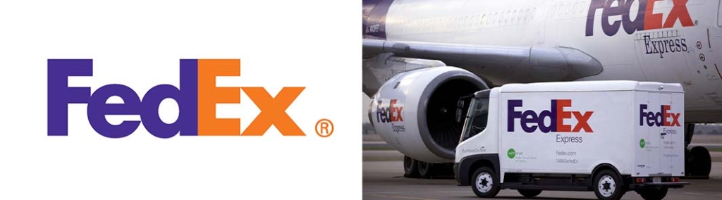
The fedex logos is one of my all time favourites designed by Landor Associates. The use of negative space is less obvious in this logo. Can you spot the hidden symbol between the E and X? Once you see it, you can’t see anything else.
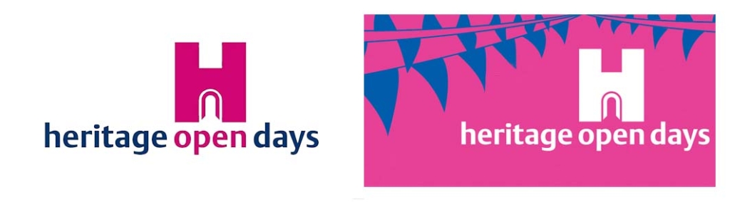
I love this logo designed for the Heritage Open Days. The word open leads the eye into the open door of negative space created by the H symbol.
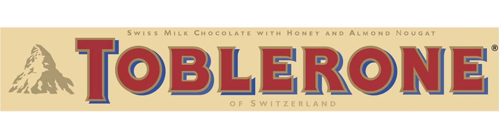
Have you ever spotted the extra element hidden in the negative space of the Toblerone logo? Have a look at the mountain to the left of the lettering… can you see the bear climbing the centre of the mountain? Toblerone chocolate originated in the Swiss city Bern in 1908, which has a long association with bears. Bern’s coat of arms has had a bear on it since the 13th century.
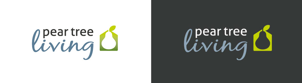
And finally… I designed this logo for Pear Tree Living, a partnership of private residential landlords based in Warwickshire. The pear shape is created out of the negative space within the house structure.


