
What makes a good logo? This is a question that brand designers like me get asked all the time.
Can anyone say what makes a good logo when there are so many different types and styles of logo out there? Especially as some of the most well known and succesful logos of all time are very different and varied in style and format?
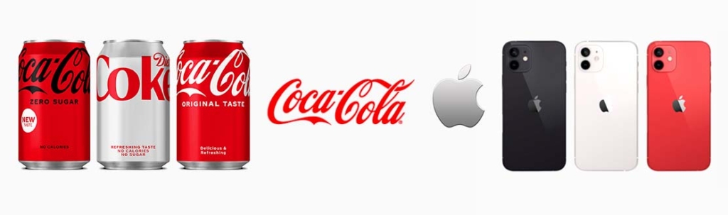
The Coca Cola logo for example is probably one of the most well known logos in modern history, yet so is the apple logo. They are both very different, one is a typographic script logo, the other a simple iconic shape. Whose to say which is best?
Well the answer is neither. They are both valid logos in their own right and there is not a one-size-fits all winning format that works for all businesses. No, the answer to what makes a good logo is about the 3 second rule.
The 3 second rule? Yep, this is how long you have to make an impression with your logo.
Imagine the scene: you are driving along a fast road. It could be a road in the countryside surrounded by fields and trees if you like… Or did you imagine a motorway with concrete walls? It is up to you, it doesn’t matter, stay with me though, as the principle is the same.
You are driving along this road, and you go round a bend and there, on the corner is a big sign for a business that is situated just behind the trees. Let’s say you are driving at 70 mph… How long do you get to look at that sign before it disappears from your range of vision?
It’s about 3 seconds.
That’s the average length of time each person will look at your logo.
Or imagine this. You’re are on the top deck of a bus, gazing out of the window. A van drives past in the next lane. Briefly, the logo on the side catches your eye, but before you have chance to look again, it has to turn left and disappeared out of view.
How long did you have to look at the logo on that van? Yep, you’ve guessed it – about 3 seconds.
Are you starting to get the picture?
Maybe neither of the scenarios above apply to your business. Maybe you don’t do big signs or vans. But believe me, whether it is on a small business card, a social media banner or a shop front – the same principle applies to all logos. Let’s face it, how long do you spend looking at the logos you see every day? You don’t really think anyone’s going to look at yours for any longer, do you?
But how do you achieve the impact in those 3 seconds, you may well ask?
Well, this come down to the logo being clean, simple and clear.
It is important to remember that a logo doesn’t need to tell the whole story, just to represent the story in its simplest form.
Does your logo work like that? Maybe you could test it by asking people to look at your logo for 3 seconds. Then cover the logo and see how much of the information they can draw or write down. It’s a great little memory test.
Think of some of the most successful logos you know: Nike, McDonald’s, or Coca Cola; if you looked at them for 3 seconds you would still recognise them, wouldn’t you?


Leave A Comment