
8 typography secrets that could seriously help your marketing material get read.
Typography, it’s all just trends, styles and looking cool, isn’t it?
There’s no science behind it.
I’ve heard people say this so many times – and about design in general too.
OK, so I will admit that a certain amount of the success of a finished product is down to its style. BUT this is only one element, amongst many, that make up a great bit of marketing.
We know that successful marketing is a marriage of images and words, right?
But how does this marriage work?
Quite simply, there is absolutely no point having a very trendy piece of design, if the core message is completely lost.
Over the last 30 years, marketers have carried out a variety of digital and offline tests that prove how readers’ eyes are influenced by various visual factors. The colour, style, positioning, and hierarchy of the words and images all play of part in determining where the eye looks and for how long.
Obviously, there is not enough time to explain all of this in one brief article. But what I can do is give you some important tips, all of which can help you improve your marketing materials, be they online or in print.
So here are my 8 typography tips for more effective marketing messages:
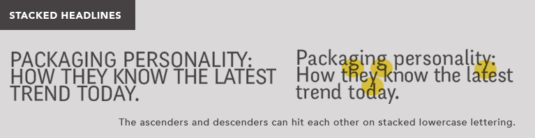
1. Use uppercase lettering for stacked headlines.
There is a current trend for using uppercase lettering at the moment. It looks great – but needs to be considered. It works very well for stacked headlines (that is, those that go across more than one line) This is because the ascenders and descenders in lowercase lettering (for example, the tall part of an “h” or the tail of a “q”) appear to become ‘tangled’ in the design of these headlines. It looks messy and can make them harder to read quickly.
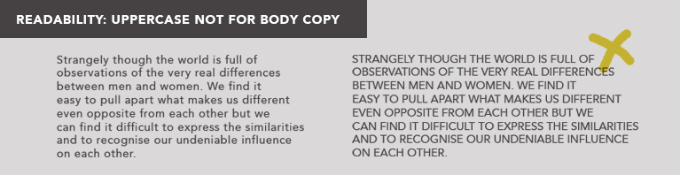
2. Don’t use uppercase lettering for large amounts of small type.
OK, so using uppercase letter for headlines really works. But the same does not apply for large amounts of smaller text (body copy). Studies show that small capitals in large quantities is difficult to for the eye to follow. It also decreases the attention span. Your reader is likely to give up earlier than if you use lower case lettering.
FACT: The terms uppercase and lowercase come from original letterpress printing. Printers stored all their lettering in cases. For ease of use, the capital letters were stored above the normal letters in a separate case.
3. Keep to standard line spacing (leading) for large amounts of small text
It may look cool to dramatically increase the space between the lines of text so the design looks ‘spacious’ and ‘airy’. It may also be tempting to squash the lines closely together if there is not much space. But reading studies show that the most natural spacing for the eye to read large amounts of text is 2pt sizes bigger than the type size. Most publishing programs are set up with roughly this amount as the automatic line spacing. If you want to increase it or reduce the spacing manually, try not to move it too far away from the 2pt rule.
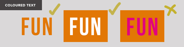
4. Avoid coloured text on coloured background
Looking for ways to make your headline stand out? Using coloured text on a coloured background is NOT the answer. Studies show that coloured words on a coloured background make it very difficult for the brain to process what the words are saying. Try using coloured words on a white background instead, or white text on a coloured background.
5. Red text is the hardest colour to read for small copy.
Red text has the lowest legibility levels when printed in smaller sizes. Studies show that it works fine for headlines, but anything smaller becomes increasingly difficult to read.
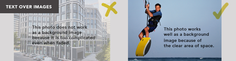
6. Images and patterns behind text
Be careful placing images behind text. Complicated images with a lot of detail (even if they have been faded back) can make the text less readable. Only images (with an area of clear space) can work behind text.
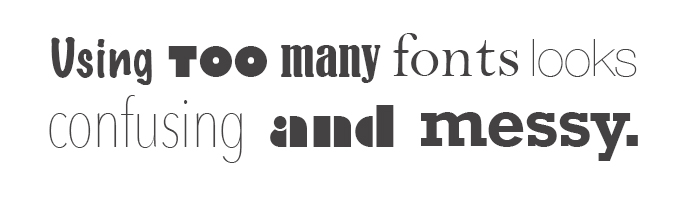
7. Don’t use too many typefaces together
There are so many typefaces out there to choose from, sometimes it’s difficult to narrow it down. But using too many typefaces with a design can make it look cluttered and difficult to read. Try to pick 2 or 3 fonts and use them consistently throughout the design. For example, using a sans serif for the main text, with a handwritten font for headers.
8. Don’t use unusual or novelty fonts for the body copy
Body copy (the smaller sized, larger areas of text) is really important. Once the reader has been attracted by the headline, you want them to continue reading down through your persuasive copy that really sells your business.
But by the very nature of their size and quantity, these words are less likely to be read from beginning to end. You can however, assist the reader by using appropriate fonts.
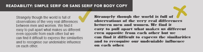
Traditionally, serif fonts (like Times New Roman) are used for body copy, because studies show that the serifs help the eye move along the words more quickly. Nevertheless, sans-serif typefaces (like frutiger and Univers) can work well too.
Avoid using any complicated, unusual or novelty fonts for body copy, as the eye finds these fonts difficult to read at a smaller size. It can seriously hinder readability.
Did you enjoy this blog? Why not sign up for our
FREE 17 Marketing tips emails delivered straight to your inbox.
Simple, easy tips that could help you think differently about your marketing. Just click here to sign up


