
Project Description
Sonder Cause Communications
Sonder Cause Communications is a public relations agency specialising in non-profit and cause-related communications for charities. It is a meeting of two women who have both worked extensively within this sector for many years, who wanted to build their own brand. www.sonder-communications.com
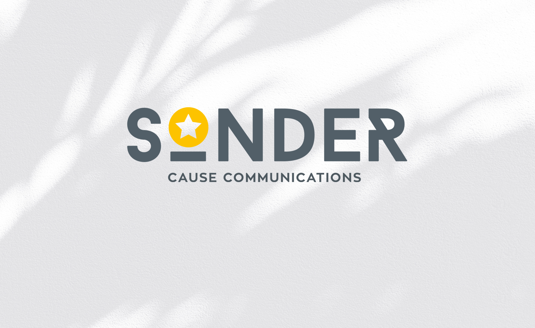
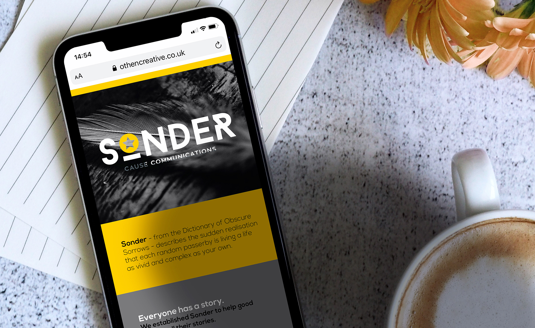
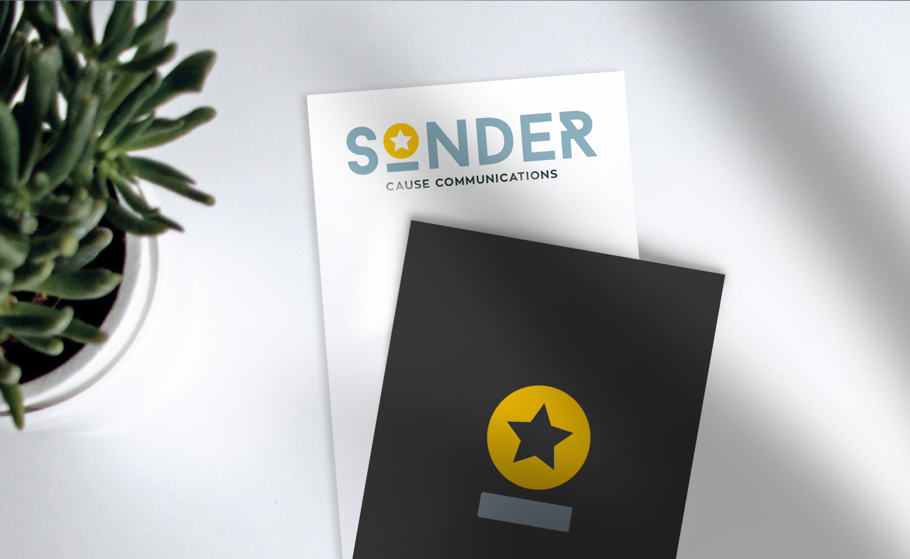
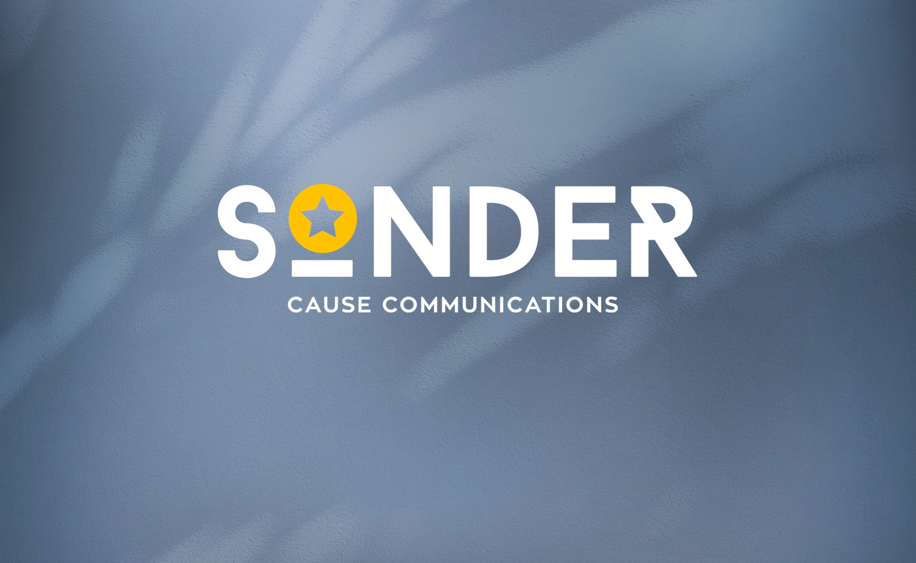
The meaning of the word Sonder, is the realisation that every other person you meet has their own story.
The brief was pretty simple really: to create a simple, impactful typographic identity that can represent the value of their business.
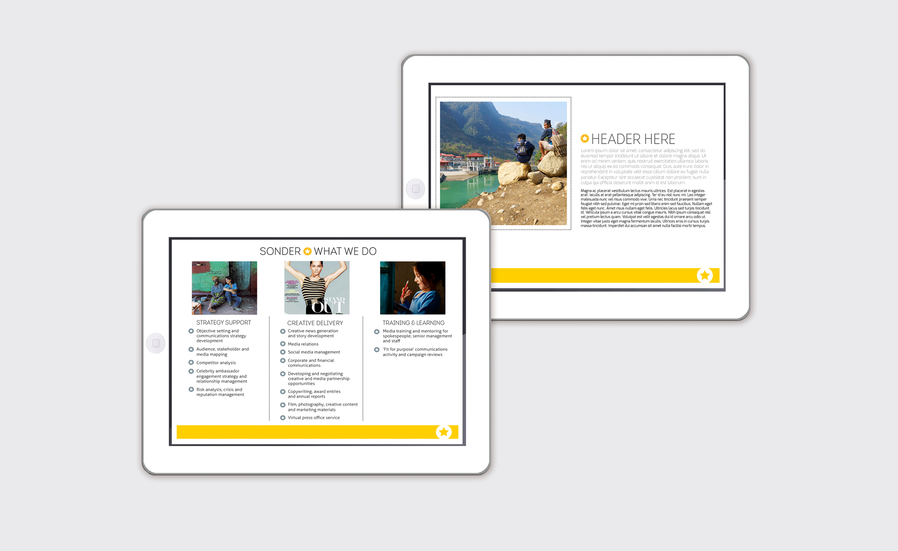
As with all my branding projects, a selection of different style routes were presented at the initial concept stage, then one design was selected for development and tweaking through to final artwork and brand colour stage.
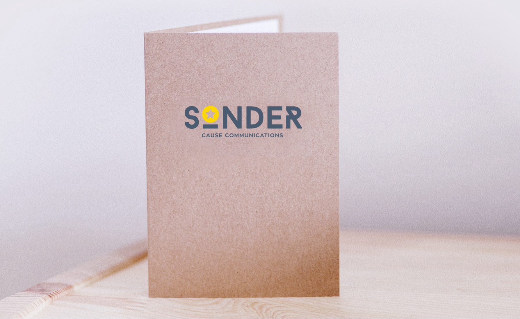
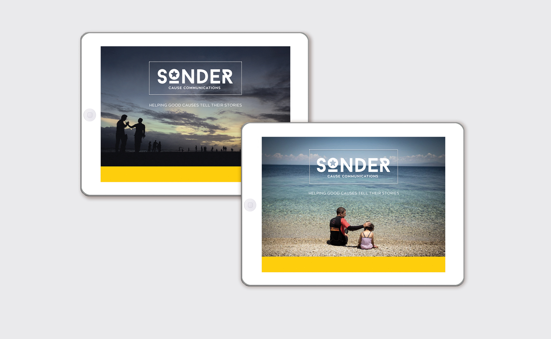
The typography is a strong classic upper case font with a distinctive letter R, which helps to balance the star symbol used within the letter O.
The star itself symbolizes the story and that the client is the central element in every story. It is also a useful design element that can be used seperately to represent the brand.
The brand colours chosen were cool neutral greys and charcoal, combined with vibrant green and yellow to represent the story.
“Steph managed to capture our brand perfectly in our new logo – while also giving clear, confident advice about branding”
